Thursday 23 March 2017

MORE MARKETING


I have once again used Graphic Burger, in order to create a way for the magazine to promote their brand. I have used a similar house style in order for the audience to acknowledge the brand and help create a strong reputation.

I think the billboard image is bold, as the title anchors the image. Also the audience will be able to understand the genre of the magazine due to the stereotypical colour 'pink' being repetitively used, alongside the strong stance of the model showing off her outfit. The way the title covers up her body, allows the audience to understand that this brand is edgy and new, whilst appealing to any young female.

The bag has a similar, almost identical style to the billboard. I think this is important because it allows members of the public who are unfamiliar with the brand to begin to notice it. This mock - up also conveys the ideology of the magazine being a posh, yet fun making the target audience want to know more.

MULTIMEDIA


Through the use of graphic burger I have been able to create a variety of different mock up's of what different multi - media platforms would look like, for the magazine Trashion.

To begin with, I started creating a mock - up page and article, for the magazines website. I ensured that I used repetitive styles and fonts through out to create a house theme. The website pages show also include similar articles, to ensure that they flow. On the homepage for the magazine I included a comments section which I thought was a successful marketing tool to use, in order to engage the targeted audience. Alongside this I also ensured to reference other social media platforms, to appeal to a broader audience and therefore become more successful.

I found it difficult when creating the mock up templates for both the iPhone and iPad due to having to ensure that they link, yet differ to fit the product. Both of them are the same, yet differ in order to appeal to the size of the screen shown.

Wednesday 8 March 2017

TRASHION MAGAZINE


Trashion is a fashion magazine aimed towards young girls and women from the ages of: 18-30. Therefore I tried to  capture this audience through the design of my article.

On InDesign I created a house style that ran throughout with four dominant colours: Grey, Coral, Pink and Black. This kept it sleek and modern looking. The grey strip ran through the article and allowed certain articles to tie themselves together.

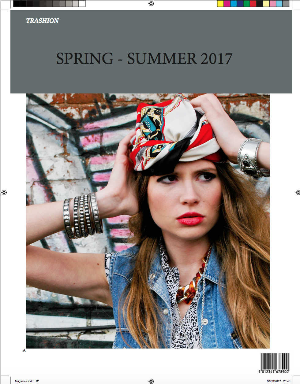
For the front page, I decided to keep it simple wi
 with the title of the magazine anchoring the image. The head shot is dramatic, exposing the makeup. My typography theme is the same throughout as it is bold and sleek. Certain quotes and tag lines have been used in this font because it allows the audience to recognise the brand.

My first page is quite simple and short. The text on the left informs the audience of what the following article will be about, alongside a model on the right wearing the particular item. In the top corners are the issue number and information of the article. Once again a repeated
theme throughout.

I have tried to space the information out within the first article, conveying the ideology of the layout as being instructions. Images have been edited on photoshop so they are of the format of CYMK. Alongside this I removed the background and edited tones, contrasts etc.

For the second article I used one simple image which took up most of the page. This allowed the information to filter around it.

After looking over my magazine an improvement I could make is with the columns. As some are of different sizes and I think this would make it look neater and therefore more professional.  However I did manage to filter information into each text box allowing it to flow.

When including references about the article I used the colour grey, the magazine, coral and any
exciting information was in pink. This once
 again tied my article together.

When trying to decide on the format of the article I found it difficult to work out how to edit the margins etc and figure out how to use the various layers. As during some instances it wouldn't allow me to add text.

My final page features an image of the fashion being advertised. It is an artsy shot, filling the page as it allows the audience to once again discover what the genre of the magazine is. I
also attempted to conform to a generic magazine house style, of just featuring images on the back page. Alongside this I repeated the header of the magazine alongside the issue and barcode to make it appear realistic.

To improve my magazine I would add more images in some of my articles so that they aren't as full of writing. I would also edit the front page making it clearer to see the font.

Wednesday 1 March 2017

Grid Layout


The house style of this magazine matches the genre of music being advertised. The layout is messy and all over the place and the font is of all different styles. This is to represent how the music throughout is individual and a way of being noticed. The artist is covering the header of the magazine and this is because they are presuming that the audience will know what it is. The magazine also runs a strict, repetitive style of placing font all around the main image to help frame it.

The Elle magazine house style is completely different to Kerang. Elle is known for being a posh, women's magazine and you are able to view this concept through it's design. The typography is repeated throughout with a strict colour scheme. Even though the writing covers her figure, it is simple, rather than covering the page.

Both magazines have a similar house style due to framing the central image, but are done in completely different ways to advertise separate genres.

The Grid

Here is my attempt of designing a magazine layout using In Design. I have kept to the same house style and font as others in my group to ensure that they all link. The image is centred at the top to attract the audience and make them interested in reading the following information on how to enter. 

Although I like this design and think it looks professional, I would like to add to it in the future in order to attract a broader audience. By doing this I would arrange the font around the image and create boxes of font to frame it. This would gain the audiences attention by highlighting key bits, making it easier for them to follow the competition. I think colour is important and as a group we could have worked out a theme to make our house style more appealing.


Colours in Photos

This image has successfully used colour to advertise the hair dressers. The background brings out the hair due to being of the same tone. Therefore this makes the hair style stand out. The colours used are pink and this is represented through society as being 'feminine.' However the hairstyle is short representing 'masculinity,' which contrasts the colours throughout. Therefore this conveys the message that the hairdressers are able to appeal to everyone's individual style, just through the colours and the product used.

This photo uses bright colours to represent the beauty of nature on a summers day. By looking at this high quality image, you are able to appreciate both the centre image and negative space contrasting it. As both colours work well together to bring out each image, the audience is drawn to this due to the bold and striking colours.

Coloured Adverts and their Effects

Colour on the advert has been used to successfully connote the theme of summer and holiday. The colours are all bold and this is done to represent the product being sold. It allows the audience to think that they are a 'cool' thing to buy and will be perfect for your summer holiday. This also allows the advertisement to be considered as 'eye catching' and therefore will attract their target audience. Colour is a successful tool to also change a person's mood. As there are no dull colours the audience will respond with happy emotions and are therefore more likely to want to engage with the product.

This Fanta add used colour to represent the product and the audience. The drink Fanta is iconically known for being orange. Therefore the colours around it frame it and allow the title to stand out. It makes you want to try the product because they are all bright and remind you of summer with the images of the sun in the background.

Referencing Images

Referencing images is important because you have to credit the photographers work and research where they came from, to ensure that they are representing the correct message. A way to do this is save the file from the correct JPG and edit it on PhotoShop.
You can also go on websites such as: Stock Image and either pay for them, or just use the images that are free. Some Universities have already bought some photos so that students are able to use them. Before using some images it is also important to check the licensing before you use it.

Album Cover Re-Make: Royalty


This album is personal for the artist as there is a song featured for his daughter 'Royalty.' Therefore, the iconography I used to represent her is through the symbol of a 'Crown' above the title. This is to convey the message that it is aimed at her. I also edited the tones of this crown to reflect the monochrome theme. However, it is the only aspect of colour that I kept. Once again I did this to represent the close bond the singer and daughter have. Another tribute I added on the cover is the date of her birth, under the album name. This therefore keeps it personal that only fans would know. 

The title is of a similar font because I think it looks sleek and smart. This therefore reflects the style of music to show how as an artist he has progressed. I used a gradual tone on Photoshop to edit the background and to add depth.
Surrounding the album there are various logos and brands that the artist represents. This is to make the album look more realistic and to show what he represents further. 


In comparison to the original back, I decided to add more images and writing to make it more interesting. Although I kept to a similar house style by having one plain cover and one more detailed, just flipped it around. I added an image of the artist and edited it so it looked more defined. By exaggerating the tones made the cover look more interesting. I ensured to add aspects like the ‘barcode’ to make it appear real. Alongside this I included all the tracks and featured artists in a different font so they are credited.

Overall I liked my album cover, yet I preferred the back due to the layout and how the track listings framed the center image. If I were to do this again, I would explore a better suited font, rather than just using one off of the adobe app. Also I would attempt to experiment more with colour.

MORE MARKETING

I have once again used Graphic Burger, in order to create a way for the magazine to promote their brand. I have used a sim...