Wednesday, 8 March 2017
TRASHION MAGAZINE
Trashion is a fashion magazine aimed towards young girls and women from the ages of: 18-30. Therefore I tried to capture this audience through the design of my article.
On InDesign I created a house style that ran throughout with four dominant colours: Grey, Coral, Pink and Black. This kept it sleek and modern looking. The grey strip ran through the article and allowed certain articles to tie themselves together.
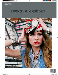
For the front page, I decided to keep it simple wi
with the title of the magazine anchoring the image. The head shot is dramatic, exposing the makeup. My typography theme is the same throughout as it is bold and sleek. Certain quotes and tag lines have been used in this font because it allows the audience to recognise the brand.
My first page is quite simple and short. The text on the left informs the audience of what the following article will be about, alongside a model on the right wearing the particular item. In the top corners are the issue number and information of the article. Once again a repeated
theme throughout.
I have tried to space the information out within the first article, conveying the ideology of the layout as being instructions. Images have been edited on photoshop so they are of the format of CYMK. Alongside this I removed the background and edited tones, contrasts etc.
For the second article I used one simple image which took up most of the page. This allowed the information to filter around it.
After looking over my magazine an improvement I could make is with the columns. As some are of different sizes and I think this would make it look neater and therefore more professional. However I did manage to filter information into each text box allowing it to flow.
When including references about the article I used the colour grey, the magazine, coral and any
exciting information was in pink. This once
again tied my article together.
When trying to decide on the format of the article I found it difficult to work out how to edit the margins etc and figure out how to use the various layers. As during some instances it wouldn't allow me to add text.
My final page features an image of the fashion being advertised. It is an artsy shot, filling the page as it allows the audience to once again discover what the genre of the magazine is. I
also attempted to conform to a generic magazine house style, of just featuring images on the back page. Alongside this I repeated the header of the magazine alongside the issue and barcode to make it appear realistic.
To improve my magazine I would add more images in some of my articles so that they aren't as full of writing. I would also edit the front page making it clearer to see the font.
Subscribe to:
Post Comments (Atom)
MORE MARKETING
I have once again used Graphic Burger, in order to create a way for the magazine to promote their brand. I have used a sim...

-
Colour on the advert has been used to successfully connote the theme of summer and holiday. The colours are all bold and this is done to r...
-
I have once again used Graphic Burger, in order to create a way for the magazine to promote their brand. I have used a sim...
-
This image has successfully used colour to advertise the hair dressers. The background brings out the hair due to being of the same tone. ...


No comments:
Post a Comment