This album is personal for the artist as there is
a song featured for his daughter 'Royalty.' Therefore, the iconography I used
to represent her is through the symbol of a 'Crown' above the title. This is to
convey the message that it is aimed at her. I also edited the tones of this
crown to reflect the monochrome theme. However, it is the only aspect of colour
that I kept. Once again I did this to represent the close bond the singer and
daughter have. Another tribute I added on the cover is the date of her birth,
under the album name. This therefore keeps it personal that only fans would
know.
The title is of a similar font because I think it
looks sleek and smart. This therefore reflects the style of music to show how
as an artist he has progressed. I used a gradual tone on Photoshop to edit the
background and to add depth.
Surrounding the album there are various logos and
brands that the artist represents. This is to make the album look more
realistic and to show what he represents further.
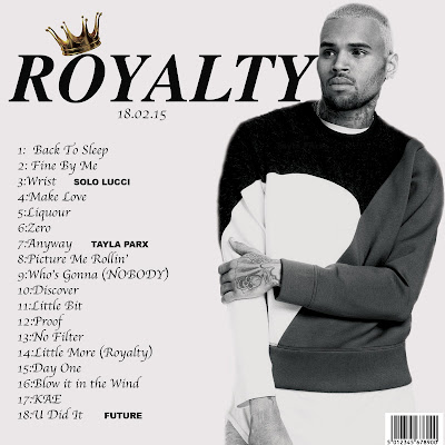
In comparison to the original back, I decided to
add more images and writing to make it more interesting. Although I kept
to a similar house style by having one plain cover and one more detailed, just
flipped it around. I added an image of the artist and edited it so it looked
more defined. By exaggerating the tones made the cover look more interesting. I
ensured to add aspects like the ‘barcode’ to make it appear real. Alongside
this I included all the tracks and featured artists in a different font so they
are credited.
Overall I
liked my album cover, yet I preferred the back due to the layout and how the
track listings framed the center image. If I were to do this again, I would
explore a better suited font, rather than just using one off of the adobe app.
Also I would attempt to experiment more with colour.


No comments:
Post a Comment